Portfolio
Please click on the images below to see a linked fullpage copy.
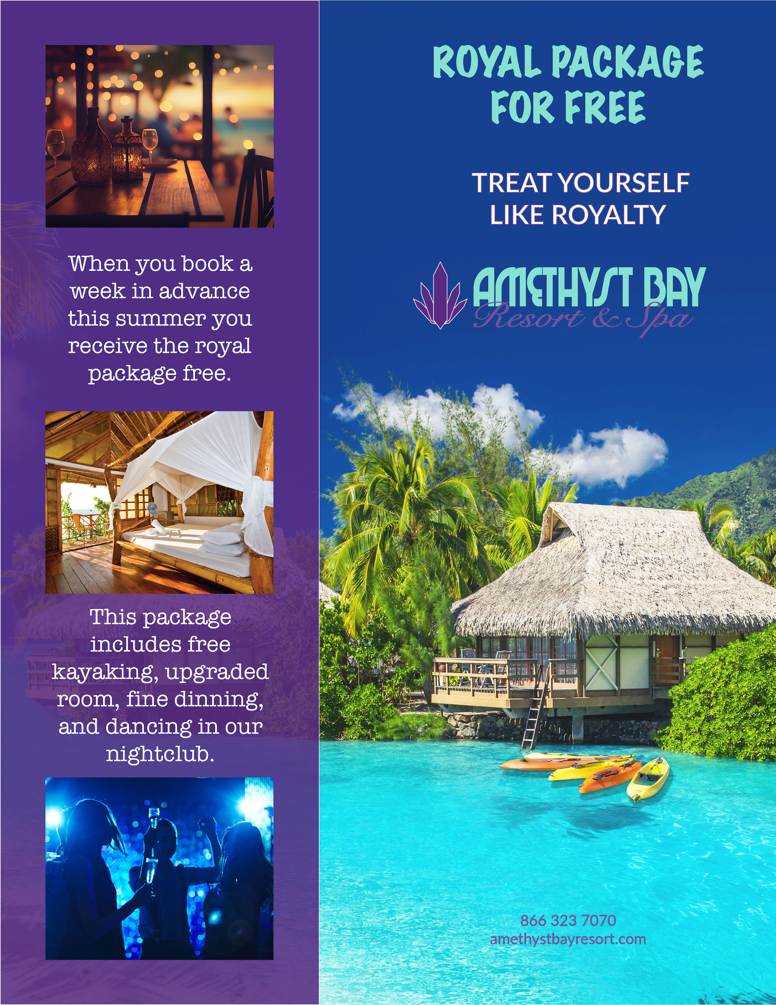
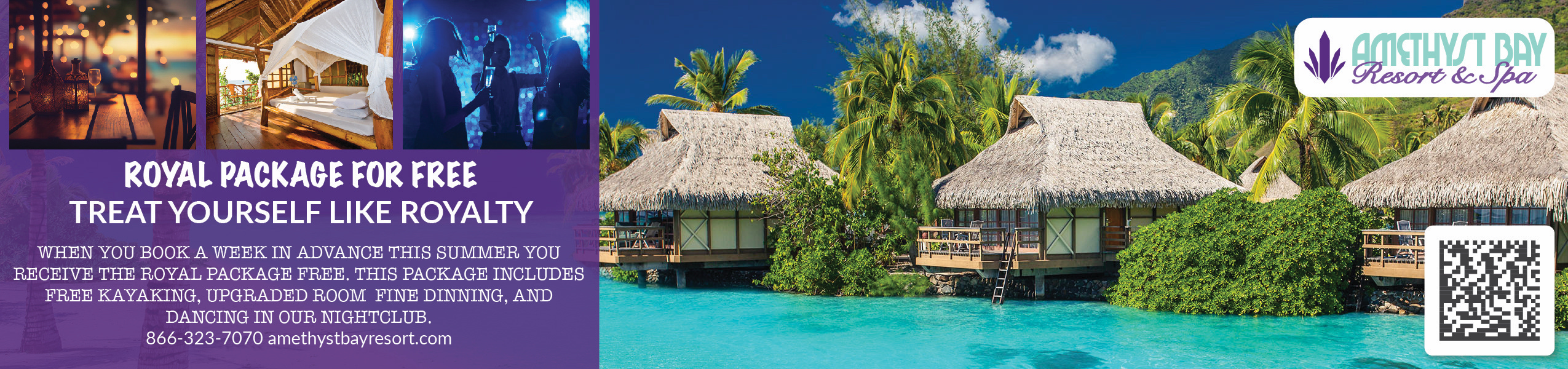
The intro to digital imaging class was early in my school career but went very well. Here is my teachers reaction to my original final. This is a new version of it and the banner ad for the same resort. These are based on a design brief that was given to us by the school.
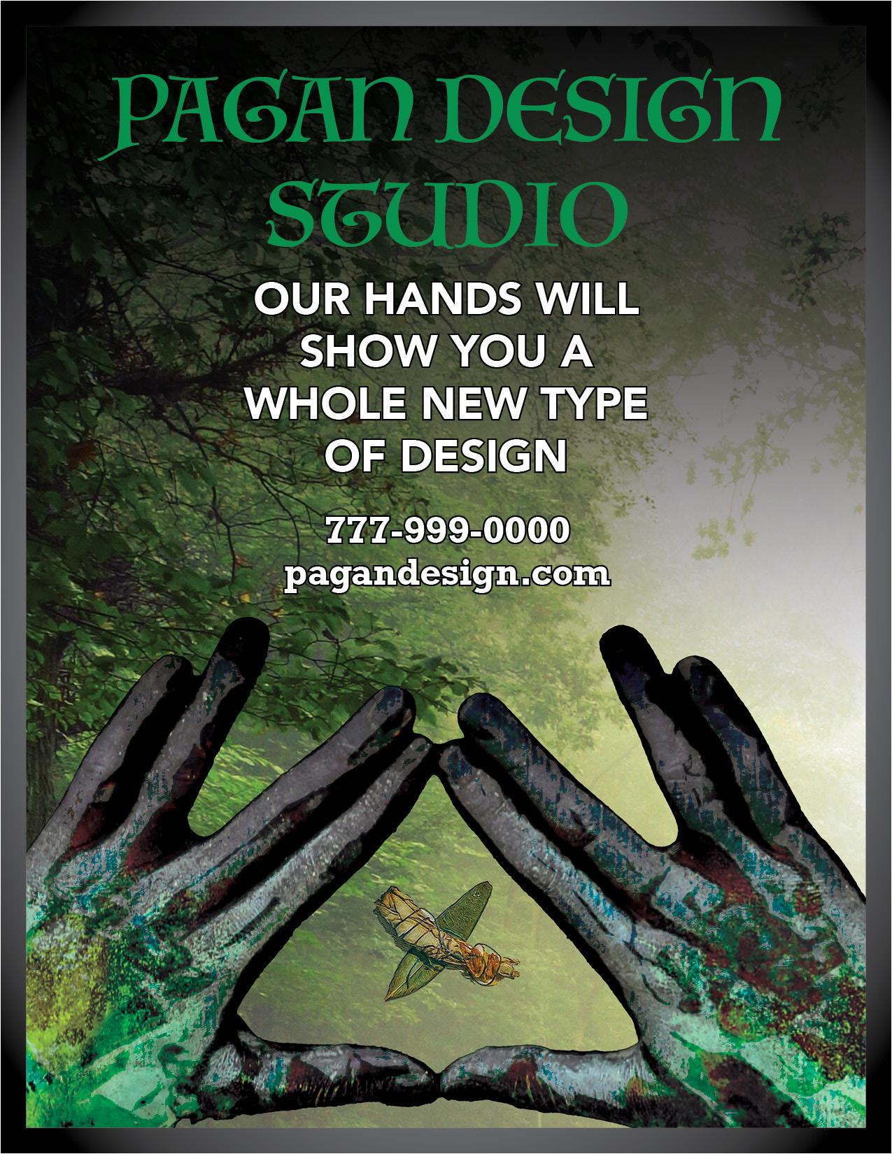
Here is a design I am working on for my daughters studio. It uses composite photos to create a mystical feeling where anything is possible for the target audience.
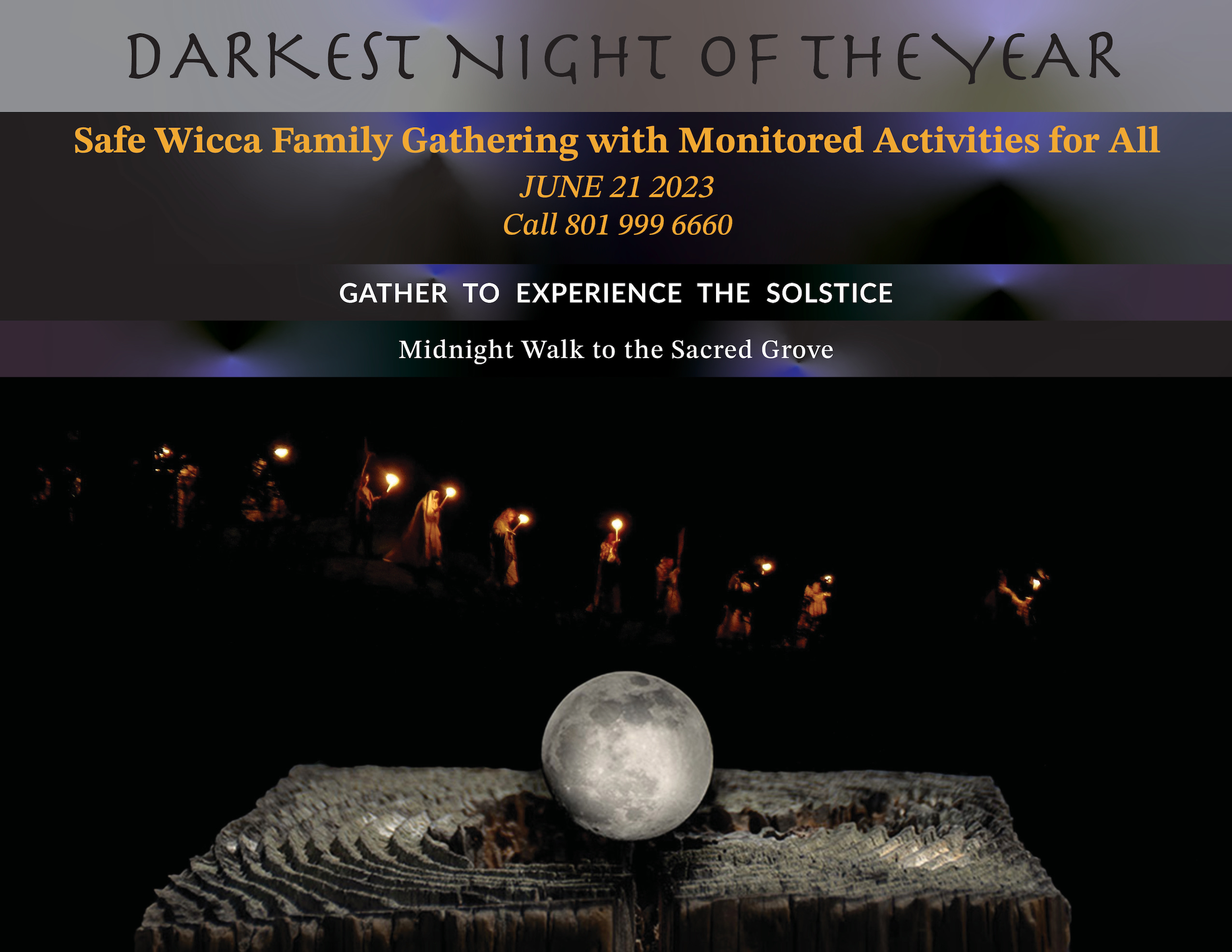
This is an advertisement that is based on a composite image using my own photography and an adobe stock photo. Though this is for an imaginary gathering it is designed to create a feeling of togetherness and adventure.
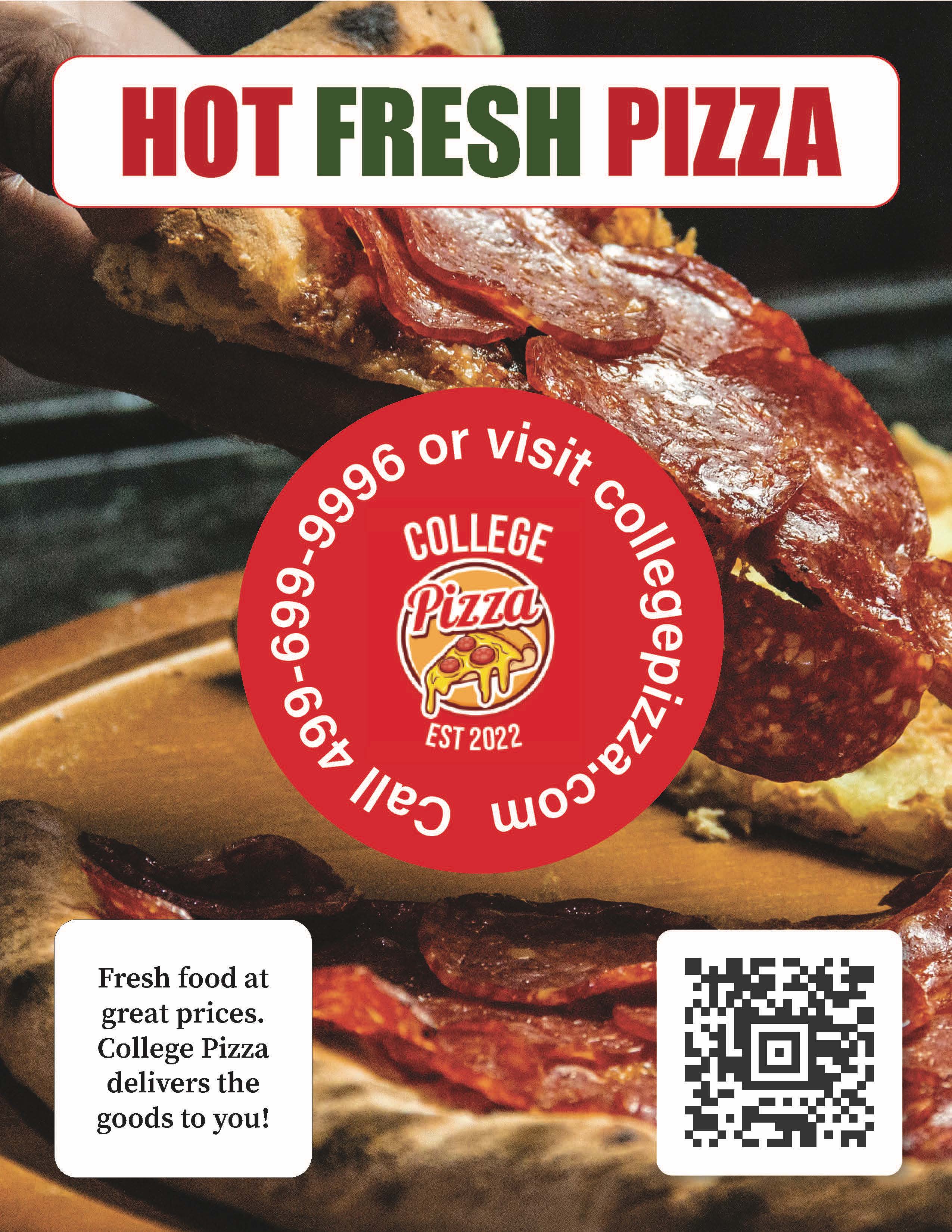
The pizza advertisement here was designed for a school project. It was based on a strict design brief. The point was to create a hand out for busy college students. We were asked to create something that could be read and understood at a glance. It was also important to express a feel of freshness without being too expensive.
Originally this ad was for an EPUB we made in class. To make it work as a print ad I first changed the background as it was too dark without its original special effects. With the advice of my professor I changed up the text as well so the hierarchy was more established. The rest of this ad worked well the first time and still does. It is simple and clear which helps the target audience. This was done with InDesign and Photoshop.
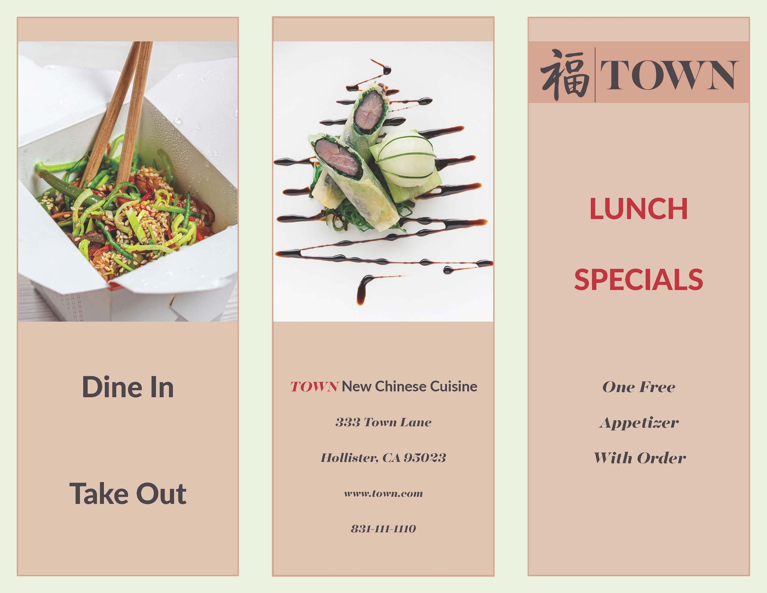
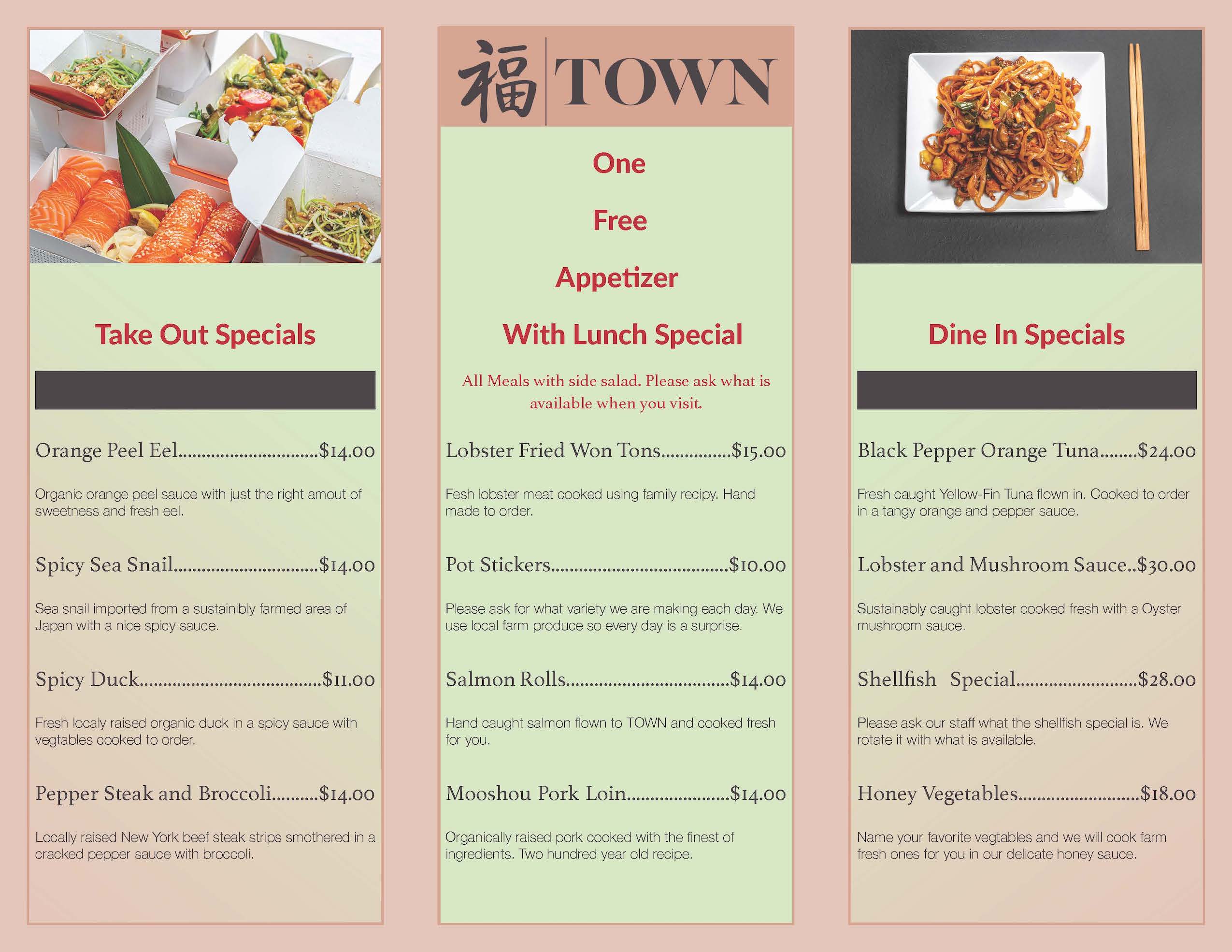
Here is the front and back of a tri-fold take home menu for an imaginary restaurant called TOWN. The design brief for the restaurant asked that it stand out from the normal Chinese restaurant so I choose a rather unusual but fresh color palette. This is an updated version of the original which is on my Classwork page.
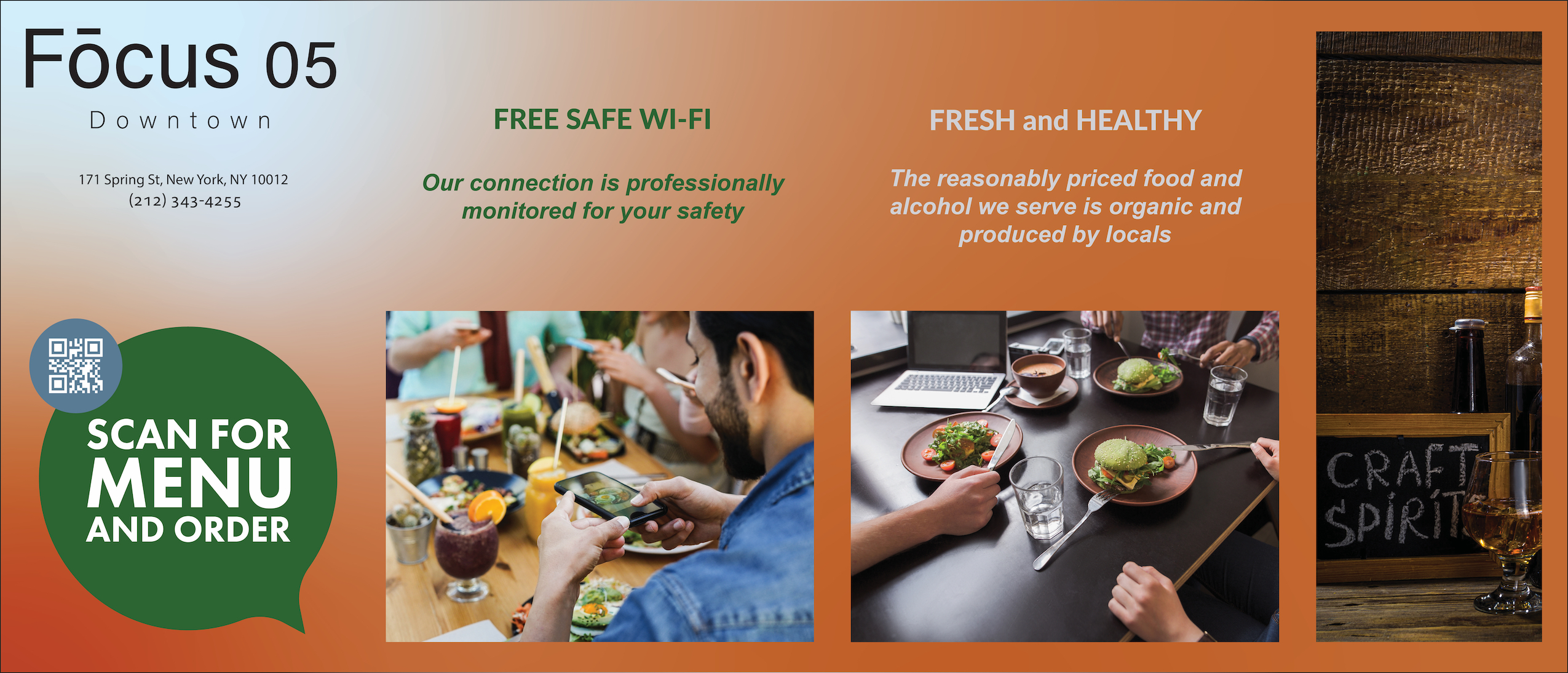
These two banner advertisements were done based on a design brief that asked me to attract more Millennials to this location. This was for a school class as well. It specifically asked for an sans serif font, natural color palette, and images of groups using technology while enjoying each other at a restaurant. The first one is my preferred design.
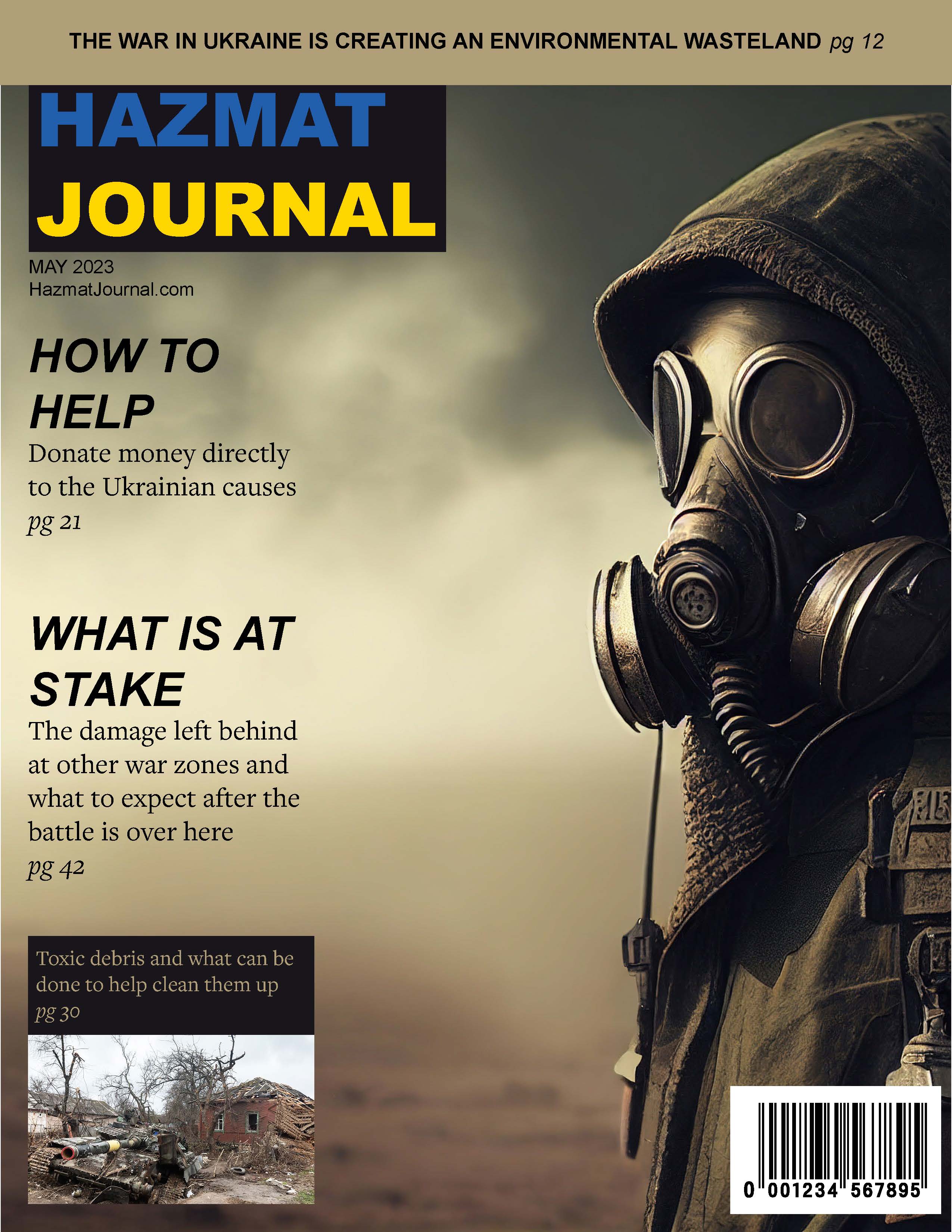
The original version of this magazine cover was one of the first things I created on Adobe Illustrator. This is an updated version both in my skill and the subject matter. I feel we should look to the future for Ukraine and it's prople. After this horrible war there will need to be an extensive cleanup and this is what I wanted to highlight with this cover.
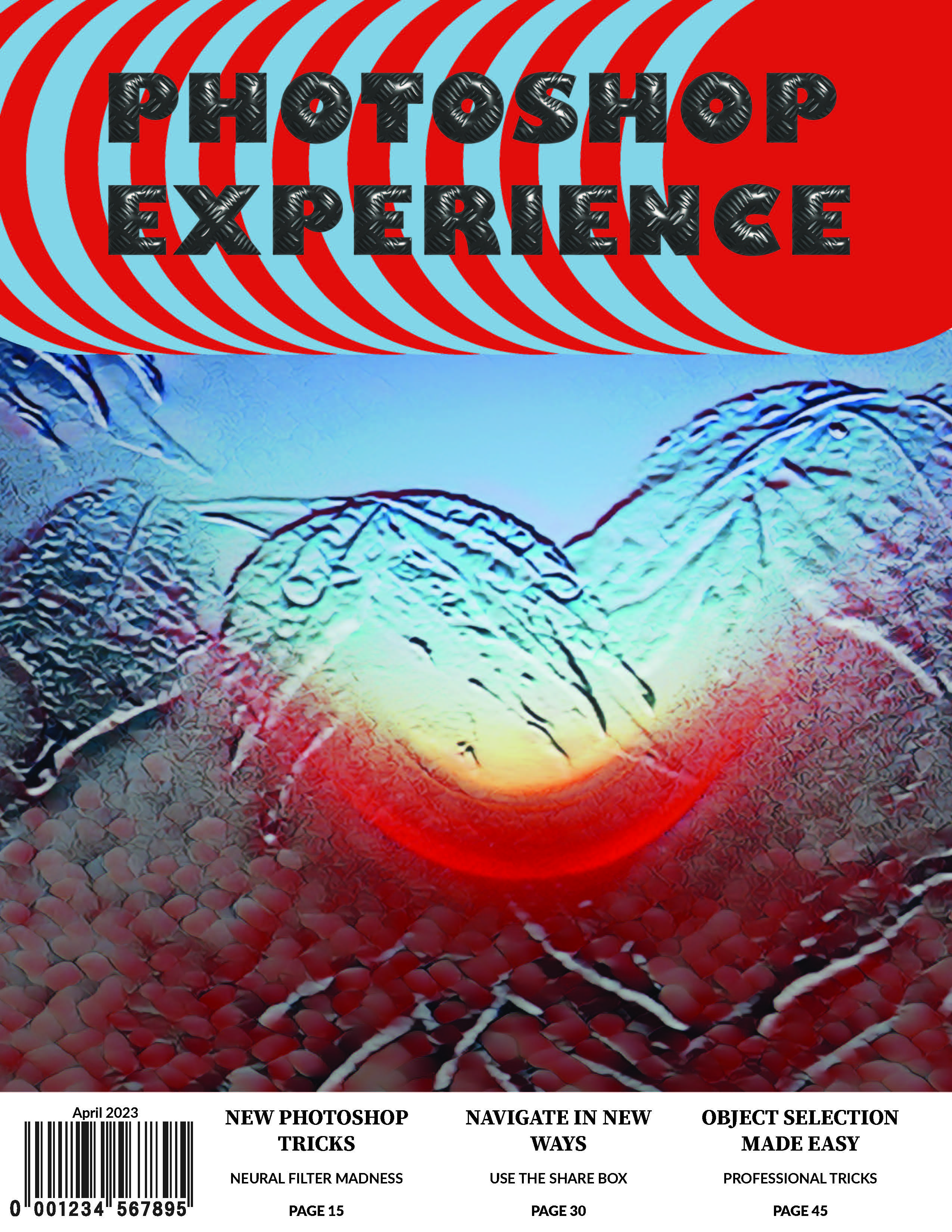
The cover image for this magazine was created more than a year ago for fun. It has since found it’s way into multiple classwork. It started life as a picture of the sunset. All the photos of this composite were taken by me and my old Nikon 500. I do a lot of my own photography. The cover is just a flight of fancy. Like a bit of punk rock trying to fit in a suit.
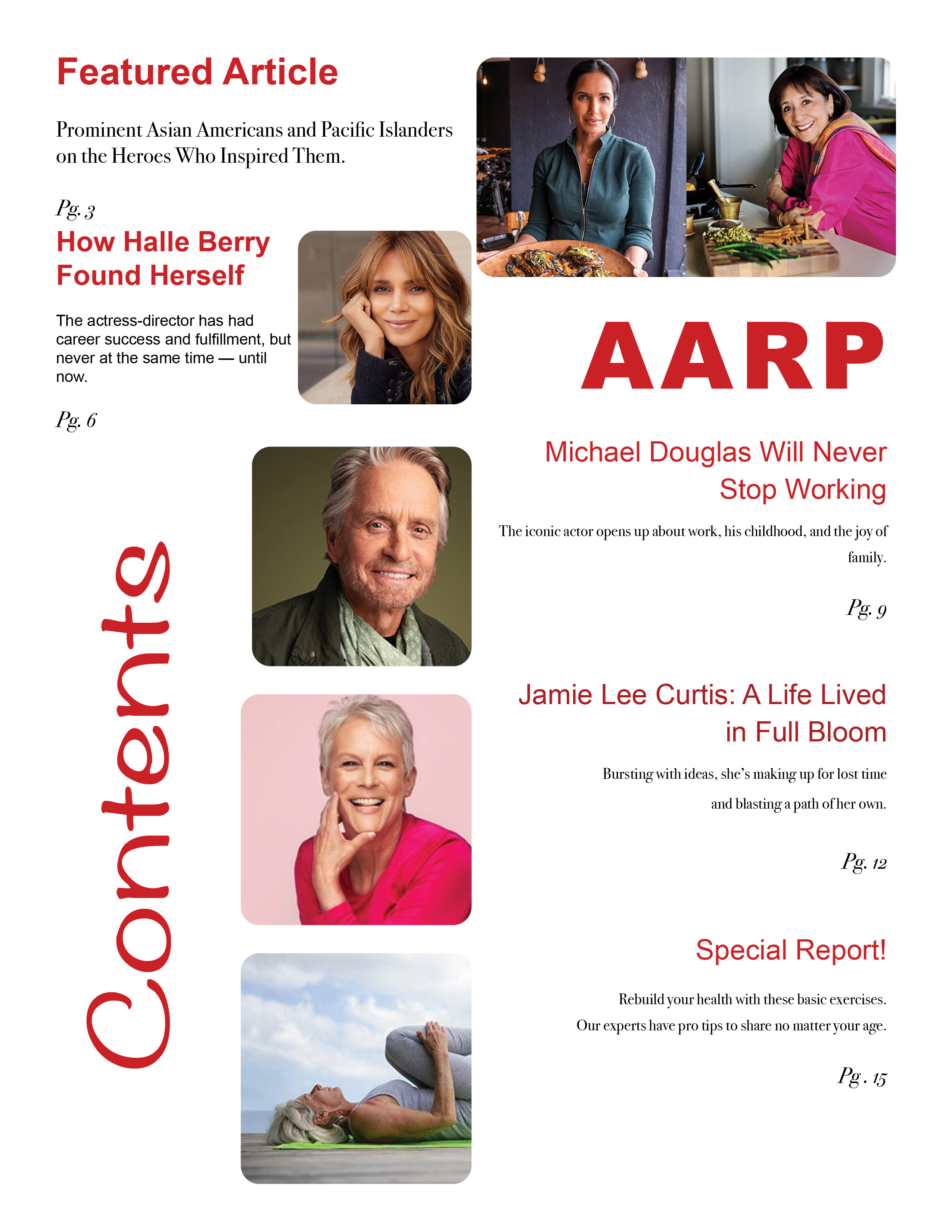
This is another page from the EPUB I did for school. My respect for the AARP led me to choose their magazine. Having worked with the elderly for years I have seen how much the help they give means. This is an update to the original table of contents from that EPUB. It has been modified to be a print work. The design has been updated greatly as well. Originally it did not fit the rest of the magazines design.
Copyright© 2023 All rights reserved